Close-up of overlapping beige serif letters R, O, and C on white background.

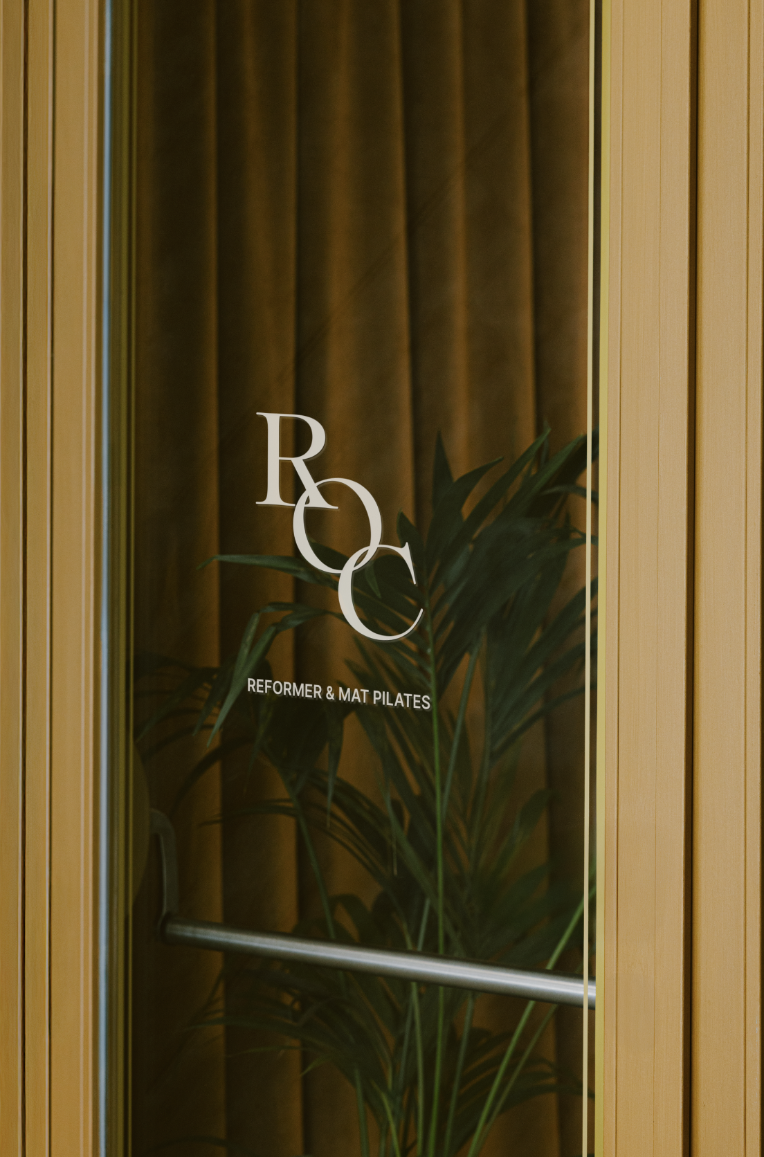
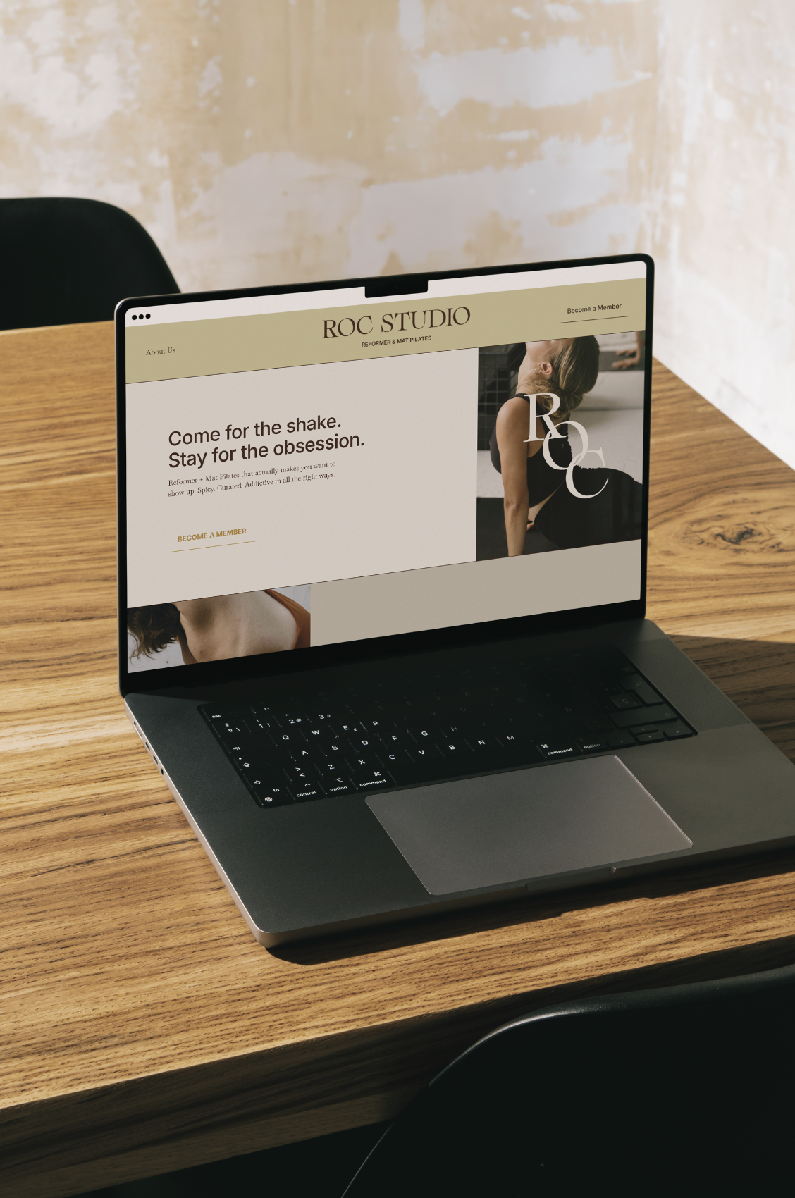
The Ask: What if the Proper Hotel & Equinox had a baby, and that baby was Pilates studio in Morpeth Newcastle? Enter ROC STUDIO.

Balanced, elevated, and not too stuffy. We wanted ROC to stand out from other competitors with mostly black & white branding, feel casual enough for the busy mom, bring California vibes, yet still fit in a neighborhood that attracts sophisticated clientele.

Glass door with the logo of a wellness studio. The logo includes the letters R, O, and C intertwined. Below the logo, the text reads 'Reformer & Mat Pilates'. Behind the door, there is a large green plant and brown curtains.
Smartphone displaying an Instagram profile with a grid layout of posts, placed on a dark brown marble surface.
Open laptop on a wooden table displaying a website for ROC Studio, a Pilates studio, with a woman in a black workout outfit doing a stretch, and the text 'Come for the shake. Stay for the obsession.'
Smartphone displaying a weekly workout schedule on a pink marble surface.